
 Once in a while, I try to take a “fresh” look at my website. I just put one of our product pages on my screen, I sit back and try to imagine what it looks like for a new visitor, who just arrived there after a Google Search.
The last time I did this, the main thing that struck me was all the Try/Buy “noise” on the right side of the screen. There’s a Sign Up for the Free Trial box, a Get it Free (TrialPay) option and five (!) different buying options (Standard, Pro, two “Pro + scanner” options, plus a “custom order” option). I realized that I had been replicating most of my shop page right there on the landing page.
So I started experimenting with a different approach, aimed at getting more people to sign up for the free trial. Then just let the trial edition and the autoresponder sequence do the conversion to sales. I didn’t want to remove all buying options though, because we see a lot of customers buying without trying. But it would have to be reduced to just one button, simply taking the user to our recently re-designed shop page.
The original design ( = Version A )
This is the A-version of my A/B split test, the original look of the product home page. The left side of the page offering lots of product information and screenshots (even separate screens for the Windows and Mac editions), the right side having all the try and buy options.
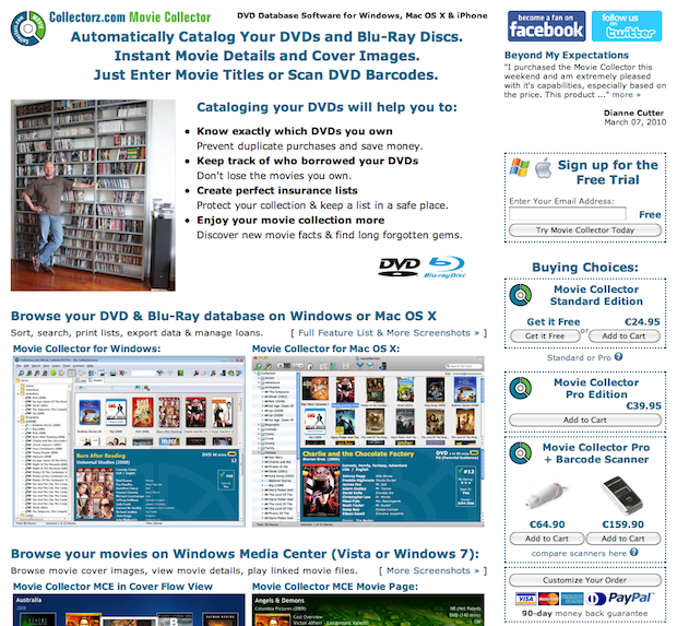
This layout has worked well for us for a long time, but for some first time visitors it may be a little overwhelming. Let’s see if we can make it a little easier on the eye.
The first attempt ( = Version B1)
Here’s my first “less is more” redesign. To reduce the noise on the right, I completely removed all the trying and buying boxes from the panel on the right, replacing them with 3 recent testimonials.
I rewrote the top part of the left side, aiming to give a full overview of the software with just 1 headline, 2 pictures and 3 bullets. Followed by two large boxes, one for the free trial, one for buying. Below these two call-to-action boxes I only placed a demo video and some more testimonials (not shown in the screen shot).

The results
Immediately after starting this test, the sign up conversion rate shot up. That was hopeful. But sales dropped.
Here’s the outcome of the A/B test after 7 days:
- Sign Ups: +12.3%
- Sales: -9.3%
- Average First Purchase: +8.6%
- Total Profits: -2.8%
After 7 days, sales in the B category had gotten stronger again, but were still 9.3 % lower than the A category sales. But interestingly, the average value of the purchases were 8.6% higher in B. So in the end, the drop in profits for version B wasn’t too bad: down by 2.8%.
What’s happening here? First, the removal of main call-to-action (buy!) from the top right seems to have resulted in the decrease of immediate purchases. The extra sign ups (and thus extra people on my autoresponder sequence) seem to compensate for this decrease later on. Maybe the autoresponder, and its Buying Guide on day 2, is also helping to increase the value of the first purchase.
The second attempt ( = Version B2)
I like the increase in sign up rate and the high value purchases of the B1 design, so it would be great if we could keep those and generate more sales at the same time.
That’s what I tried to accomplish in the in B2 version shown below, by adding two call-to-action boxes on the top right again, in the same style as the big ones on the left.

The results>
I tested this B2 version against the original A version, still my control. I let the test run for 18 days, so that the trial version and trial autoresponder would have the time to do their jobs.
- Sign Ups: +8.8%
- Sales: +5.9%
- Average First Purchase: 0%
- Total Profits: +5.9%
All numbers are green, so that’s great 🙂
But if we look more closely, we find two interesting numbers, especially if we compare these results with those of the previous test:
First, the increase in sign up rate is lower for B2. Which is strange because there are two sign up boxes now, one on the left and one on the right. Did version B1 have more focus on the two big boxes on the left, just because the panel on the right was more noise-free?
Also, we lost the increase in purchase values that B1 gave us. However, looking at the details I found that the average purchase was $50.30 for both B1 and B2. For some strange reason the value for A had gone down to $46.30 during the first test.
What’s next
I am preparing a 3rd test now. Version B2 will be my new control ( = my new version A). For the new challenger I am reintroducing the big screenshots of my iPhone apps (because these has gotten lost in the redesign).