
 Last week, Dan McGrady reported how he improved his conversion rate by 72%. One of the things he did was changing his signup button from green to red. This alone gave him a 21% increase in conversion.
Interesting results, so I tried some experiments with the color of my own sign up buttons.
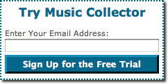
On the Collectorz.com website the main call-to-action buttons (Try and Buy) are a dark shade of blue (what we call “collectorz blue”). This results in a nice and quiet look. But if I can get more sign ups by introducing a noisy Sign Up button, I won’t complain.
The Red Button
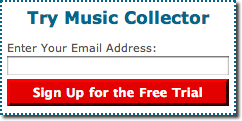 I tried a red one first. It sure stands out 🙂
The results after about 400 sign ups:
The conversion rate dropped by 9%.
Not quite what I had expected. Maybe red is too much of a danger color? Are people scared to click a big red button? Or maybe it’s too red and will a softer shade of red do better?
The Green Button
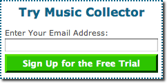 Next attempt: a green sign up button. IMO it looks a bit nicer than the red one. But that’s not what counts, is it? Will it get more people to sign up for the trial? Ehm… no…
The results (400 sign ups counted):
13% less sign ups.
That’s even worse than the red one.
Back to Blue it is
Well, that didn’t work. So for now I am back to the blue buttons. I still think that making the free trial option stand out more is a good idea. But apparently not like this.
Maybe I should have tried Dan McGrady’s 3rd tip first: “Change the button text from “Signup for Free” to “Get Started Now”. Dan says:
“Get Started Now” is an easier sounding commitment than signing up. Signing up also has connotations with paying.
Make sense, so that’s what I am testing at the moment.
Colours are a tricky issue on buttons anyway. It would probably be interesting to differentiate the profile of all signups (e.g. is there is difference concerning the countries involved, more corporate or more single-user etc.)
back to green now I see? does this mean you are testing different text on a green background?
any % stats for this new text and green button?
Yep, back to green.
The trick was to make BOTH the Try and the Buy button green.
But yes, I have also been testing the text on the button. I moved from “Sign Up for the free trial” to “Start your free trial now”.