 The A/B split test for my new product page has been running for a week, but the new design isn’t working yet. The results after one week:
- Sign Ups: 1.0% more
- Sales: 17.1% less
- Average Purchase: 3.0% higher
- Total Profits: 14.8% less
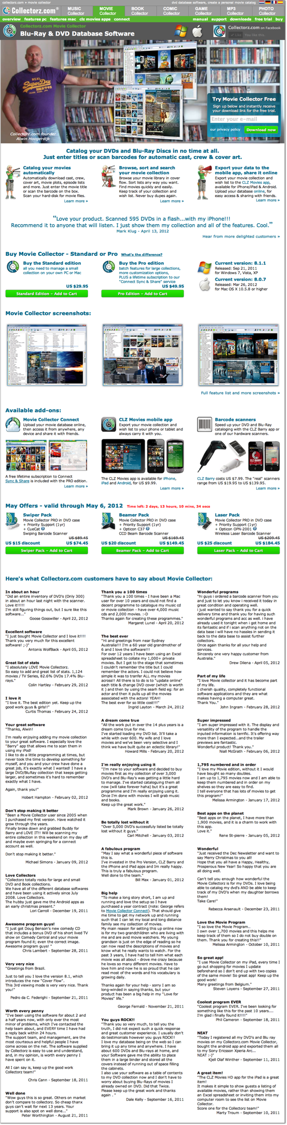
I am especially disappointed with the Sign-Up conversion rate. It has increased, but only slightly. I was expecting more from the strong focus on the calls-to-action in the top section. Maybe having two CTAs there (try and buy) is not the way to go. Let’s tweak and then test again:
Here the changes I made:
- Just one call-to-action (sign-up for the trial) in the top section.
- To make up for the loss of the buy box at the top, I moved the buy boxes in the content up to just below the big testimonial.
- Removed the “sign-up for the trial” box from content. Replaced with “Current Versions” box, to indicate recency.
- Rewritten the copy of the 3 feature boxes at the top, to make them less vague, plus mentioning the mobile and online apps.
- Optimized image size to improve page speed.
- Added drop shadow to screenshots in content to make them look nicer and stand out more.
- For consistency of the look and feel between the landing page and the rest of the site, I implemented the fancy buttons everywhere, on the features pages, on the buy pages, etc… in versions A *and* B.
And now… we wait.