
![]() At the SIC in July 2008, WinZip’s Edwin Siebesma told me that I should talk to the TrialPay people. I did and I liked their sales pitch.
At the SIC in July 2008, WinZip’s Edwin Siebesma told me that I should talk to the TrialPay people. I did and I liked their sales pitch.
Of course, like everyone else who first hears about TrialPay, I had fears of cannibalizing my existing sales by offering a TrialPay option on my website.
So in August 2008 I ran a simple A/B split test, testing just that:

- Group A: my regular product pages, no TrialPay option
- Group B: An extra “Get it Free” button, taking visitors to the TrialPay offer page. Just for our Standard edition (regular price $29.95). The button was a regular HTML button, just like our other “Add to Cart” buttons. Like so ->
The results were surprising: After tracking 240 sales (in 10 days), the profits in the B group were 30% higher. The extra TrialPay sales (only 13) didn’t account for that increase, so having the TrialPay option was generating more regular sales too.
My guess is is that the presence of the “Get it free” button had lowered our bounce rate and got first-time visitors to stick around just that little bit longer. Then they eventually ended up buying in the normal fashion (maybe because they want the PRO edition or something).
New website design, new TrialPay box
 Then in May 2009, while toying and struggling with a new website design, I introduced a new TrialPay box. With a nice TrialPay logo, a short explanation and a big “Get it Free with TrialPay” button. Pretty cool looking box.
And without testing, I just added it to the new product pages. I know, completely unlike me as I normally test everything. My only defence is that I was testing other important changes at the time. Still stupid, I confess 🙂
A couple of weeks ago, I noticed that my TrialPay profits were slowly decreasing in the past couple of months. Also, we had been getting some confused customer emails, who had clicked on to the TrialPay website, looking to download our trial edition.
“trial pay, get it free” “free trial edition” … I can see the confusion, especially if the two options are placed close to each other.
Anyway, reason enough to look into the presentation of the TrialPay offer again.
Of course, with another A/B split test:
Split testing TrialPay presentation
Here’s the two designs I tested against each other:
- Version A: a very prominent TrialPay box, right below the Free Trial box and above the Buying Options. The first buying box offers both the Standard and the PRO edition, as side by side choices.
- Version B: here I went back to the old box, offering TrialPay very subtly, as a free “buying option” inside the Standard edition buy box. The PRO edition has been given its own box.
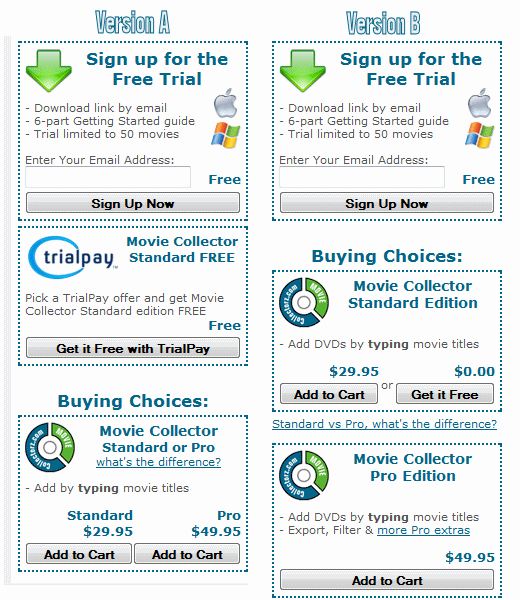
The results
After four weeks and a total of 1290 sales, version B is resulting in 4% more customers and 4% more profits. The number of trial sign-ups was 2% higher too. The average first purchase was exactly the same in A and B.
The difference is not large, but after tracking this many sales, we can safely conclude that version B is doing better. On top of that, during the entire test, version B has been ahead. After two weeks of testing (enough data to make a decision), B was ahead by 10%. So I am quite confident in choosing for design B.
Also, the test shows that the way you present the TrialPay offer on your landing page can have a considerable impact on performance. In this case, it looks like bigger wasn’t better. And placing it right besides the “free trial” option could be confusing, maybe because of the “trial pay” name?
Other ways to use TrialPay
The above only discusses the usage of TrialPay on your product page, or landing page. But of course there are various other ways to use TrialPay.
At the moment we are also presenting users with the TrialPay option in our “trial expired” screen and on our upgrade pages (where people pay for the upgrade to a new version). Both with limited success. I am getting some “sales” that way though.
I am still planning to experiment with other placements, like:
- Download page: offering the “free trial” and a “get the full version for free” side by side. TrialPay tells me that this has been quite successful for several of their vendors.
- Exit popup: showing the TrialPay option in a popup when people leave your site without buying
- After uninstall: a bit desperate maybe, but who knows?
- Pirates: Can you detect pirated copies or usage? Maybe you can convince some pirates to get a full version for free?
Other ideas are welcome. Post below if you are using TrialPay in a creative way.
I pop-up the trialpay offer on uninstal onlyl. The conversion rate has been pretty miserable:
http://successfulsoftware.net/2009/05/31/trialpay-results/
I think it is too late by then. I might try it on an adwords landing page.
Pingback: TrialPay Avangate solution for the crisis situation | Avangate Blog - Software Business Blog