
 Through the years I have been experimenting with many different landing page designs and layouts. And there is one factor that’s consistently proving to improve conversion rates.
Or, to be more precise, consistently causes a decrease in conversions every time I stop doing it:
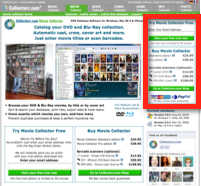
Having my main call-to-actions (Try and Buy) on the top right of the landing page
Last year, I tried a design with big Try and Buy boxes in the central content only, but it didn’t work.
In another test, I put my Facebook fan-box top-right, moving the Sign Up for the Trial and Buy Movie Collector boxes down a bit (but right below the Facebook thingie). Not a good idea (though we did attract slightly more Facebook fans).
In the past couple of weeks, I tried something similar again: I removed the panel on the right altogether, going for a 2-column website design. And again, conversions to the trial sign-up dropped immediately. After reintroducing the try/buy boxes on the top right, and we were back in business.
For me, for my business and for my audience, top rights seems to be the place where my Try and Buy actions need to be. Have you tried this for your website?
But, as I will stress in my upcoming ESWC presentation, make sure to A/B split test it on your website, with your audience. Your results may very well be very different.