A/B/C split test: The power of a smile

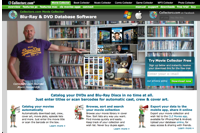
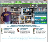
An A/B split test I did in April this year showed that for my Collectorz.com landing pages, photos of real people worked better than cartoons. So the completely new site design I created in June features large header images showing either me or my wife standing in front of our movie and book collections, like this:
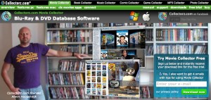
But a comment by Gleb Koshuiko on this blog (“Try to smile on the photo”) and one by a fan of our Collectorz.com Facebook page (“that is one angry dude”) made me think:
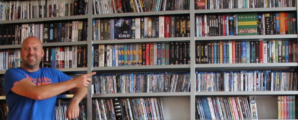
What would happen if the landing page had a smiling Alwin instead?
Or, let’s take this one step further, would it help if the person in the picture smiled and pointed to the main call-to-action, the free trial box?

So that is the test I just completed: Serious vs Smiling vs Pointing.
Continue reading

More site design tests and… Success!

My new site design is finally performing better than the old design! But it took some tweaking and of course A/B split testing to get there.

Interestingly, the key changes were all related to the presentation and location of my main calls-to-action: try and buy.

Here’s an overview of the new design, the tweaks, the split tests and the test results.
Continue reading

New website design – take two

The A/B split test for my new product page has been running for a week, but the new design isn’t working yet. The results after one week:

  • Sign Ups: 1.0% more
  • Sales: 17.1% less
  • Average Purchase: 3.0% higher
  • Total Profits: 14.8% less

I am especially disappointed with the Sign-Up conversion rate. It has increased, but only slightly. I was expecting more from the strong focus on the calls-to-action in the top section. Maybe having two CTAs there (try and buy) is not the way to go. Let’s tweak and then test again:
Continue reading

A/B split test result: trial sign-ups are down, but profits are up?

After running an A/B split test, when the results are in, you always have to make the decision:
Do I switch to the new version or not?

If the difference in conversion is large, the decision is easy: just switch to the best version.
If the difference is small, the decision may be harder, but then again, which way you go doesn’t matter much anyway.

However, I have just done an A/B test where the difference in results is large, but still it’s not clear whether I should stick with version A (my control), or switch to version B (my challenger). Here’s my test: Continue reading

A/B split test: cartoons vs photos

For the past 2 years, our Movie Collector product page has shown a picture of me standing in front of my own DVD collection. Similarly, the Book Collector home had a picture of my wife Sytske and her book collection.
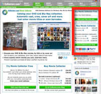
But then we had nice cartoon characters created, mainly for use in advertising material. Being happy with the results, we thought: let’s use these characters on our product home pages too. It would improve the “after-ad-click” recognition of the visuals and of course, it just looked nice.

So we replaced the photos with the cartoon characters, without split-testing.

Recently, while staring at our website, I started wondering: was this really a good idea? The cartoons may look nice but do they really work better than the photos?

So I finally did the A/B split-test: Cartoons (A) vs Photos (B). Continue reading

Top right

Through the years I have been experimenting with many different landing page designs and layouts. And there is one factor that’s consistently proving to improve conversion rates.

Or, to be more precise, consistently causes a decrease in conversions every time I stop doing it:

Having my main call-to-actions (Try and Buy) on the top right of the landing page

Continue reading

Speaking at ESWC 2010, about “The Art of Testing”

In about 3 weeks, on Saturday November 6, I will be speaking at the

10th European Software Conference in Vienna.

The session is called “The Art of Testing” and will be about A/B split testing. The focus will be on testing website designs, and I will discuss:

  • Introduction: Why you should be testing.
  • The tech stuff: How you can do simple A/B split tests and multivariate tests.
  • The fun stuff: What to test? What website changes should you focus on?

Two ten-year anniversaries

The conference in Vienna will be the 10th European Software Conference, but, as it happens, Collectorz.com is also celebrating its 10 year anniversary this November.

So we have decided to sponsor the “Pre-event meeting” on Friday night and all conference attendees are invited.

Drinks and finger food are on me 🙂

See you there!

Software pricing : Standard and Pro editions

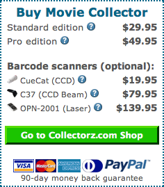
Our Collectorz.com programs are all available in two editions: Standard and Pro. The Standard edition sells for $29.95 and is lacking a couple of “advanced” features compared to the $49.95 Pro edition.

We have been selling our software this way for a long time. Before we introduced these two pricing levels, we were selling our software for $29.95. Adding the more expensive Pro edition for $49.95 was a good way to increase the price without dropping the old price. After the change, about 80% of our customers started opting for the Pro edition, causing a nice jump in profits.

The presence of two editions also gives our visitors a choice. Price conscious customers can opt for the cheaper Standard edition. Buyers just looking for the best, regardless of price, can choose the Pro edition. The availability of choices helps to increase conversion rates.

As you can see in the image above, we have done something similar with our range of barcode scanners, a cheap CueCat for $19.95 as an entry level scanner, a deluxe laser scanner for $139.95, and a mid-level option for $79.95.

But offering multiple editions also has one drawback: it adds complexity. Continue reading