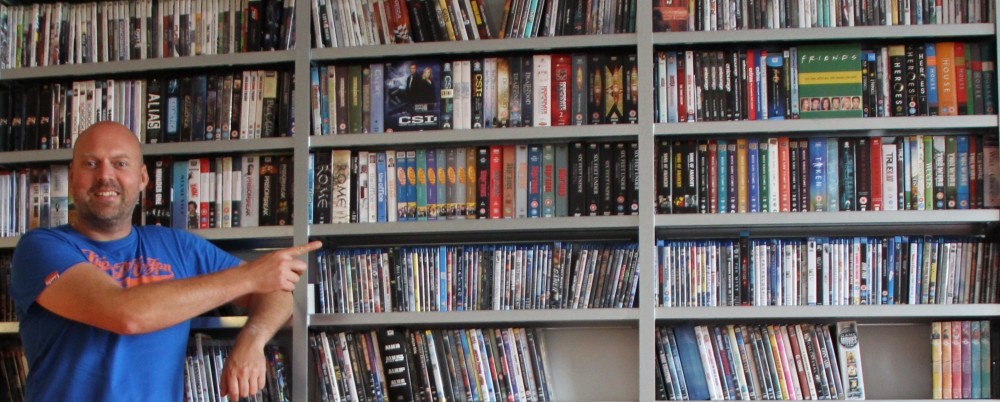
An A/B split test I did in April this year showed that for my Collectorz.com landing pages, photos of real people worked better than cartoons. So the completely new site design I created in June features large header images showing either me or my wife standing in front of our movie and book collections, like this:
 But a comment by Gleb Koshuiko on this blog (“Try to smile on the photo”) and one by a fan of our Collectorz.com Facebook page (“that is one angry dude”) made me think:
What would happen if the landing page had a smiling Alwin instead?
Or, let’s take this one step further, would it help if the person in the picture smiled and pointed to the main call-to-action, the free trial box?
So that is the test I just completed: Serious vs Smiling vs Pointing.
 My
My  The A/B split test for my new
  After running an A/B split test, when the results are in, you always have to make the decision:
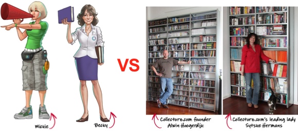 For the past 2 years, our Movie Collector product page has shown a picture of me standing in front of my own DVD collection. Similarly, the Book Collector home had a picture of my wife Sytske and her book collection.
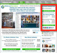 Through the years I have been experimenting with many different landing page designs and layouts. And there is one factor that’s consistently proving to improve conversion rates.
 Last week, Dan McGrady reported
  Once in a while, I try to take a “fresh” look at my website. I just put one of our product pages on my screen, I sit back and try to imagine what it looks like for a new visitor, who just arrived there after a Google Search.