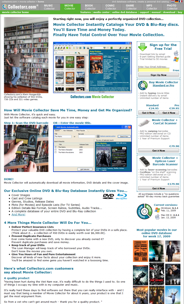
Last week, I told you about the A/B split test I started, comparing my old website design vs a radical new design. I was planning to let it run for 2 weeks, unless the results after 1 week would be dramatic. Well, they are:
These are the results after 7 days (A is the old design, B is the new design):
- Downloads: About the same
- Sign ups: 20 percent more for design B
- Sales: 19 percent less for design B
- Profits: 10 percent less for design B
- Average First Purchase Value: 10 percent higher for B
The bad…
The number of sales are down. Not good. Maybe moving the download/buy panel lower on the page wasn’t such a good idea after all.
Profits are down too, but interestingly enough not by as much as the number of sales. Interesting.
The good…
The Average First Purchase Value is up. Which explains the relatively low drop in profits.
Not sure why though, maybe because the new buy boxes explain the difference between the bundles and the scanners better, so that more people opt for a more expensive package?
The number of sign ups for the free trial are up too. That’s great.
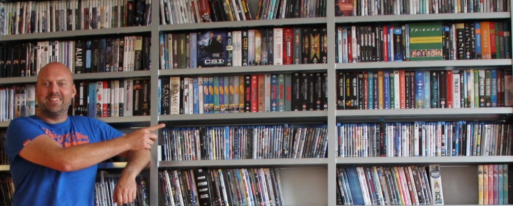
Why? Maybe because the new look and the handsome bald guy top-left lowered the bounce rate? (I see no direct evidence of that in my website stats though).
Or because of the clear bold red “Click here for FREE trial” link under the main screenshot?
It is worrying that the increased number of sign-ups does not seem to translate into sales. At least, not within 7 days.
(On average, our customers buy within two days after their visit, though I am seeing slower conversions lately. Maybe the financial crisis is causing this?)
So… what to do?
Overall, it seems that the lower number of sales is killing the results of the B version now. So let’s try to get those up by making the buy boxes more “in-your-face”.
Today I started a new A/B test where B has the main “call for action” boxes on the top right again ( A is still the old design). The rest of the new look is kept as is, including the design of the download/buy boxes themselves.
I am sad that the testimonials at the top right had to go. I liked those there…
Anyway, here’s the new B design. Waddaya think, will this one beat the old layout?

